Here's how you can setup layout grids, 960 grids, 12-column grids, or any variation that you prefer for web design on Affinity Designer.
Affinity designer is one of my favourite and go-to tools for web design, especially for static web mockups. Once you get the hang of how to use all their available tools, you can go about with your mockups really efficiently.
Affinity has the ability to easily set up 12-column grids, or any other setups your prefer, with snapping capabilities. This helps you to intuitively keep your designs and layouts consistent throughout the page.
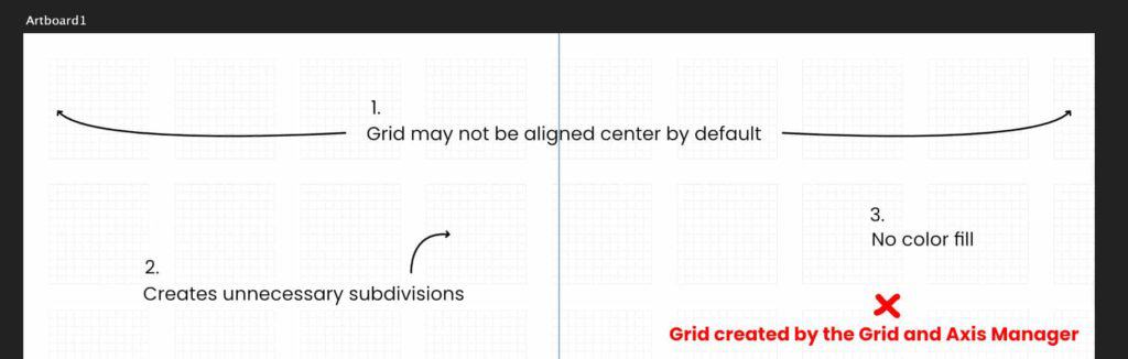
There are 2 obvious ways to go about creating the layout grid.
The first way is using the Grids and Axis Manager, the other way is using the Guide Manager.
For the purpose of web design, I have chosen to use the Guide Manager over the Grid and Axis Manager for these 3 big reasons:
The Grid and Axis Manager is definitely a handy tool when it come to many other workflows, but the Guide Manager is by far the better choice for designing web page layouts.
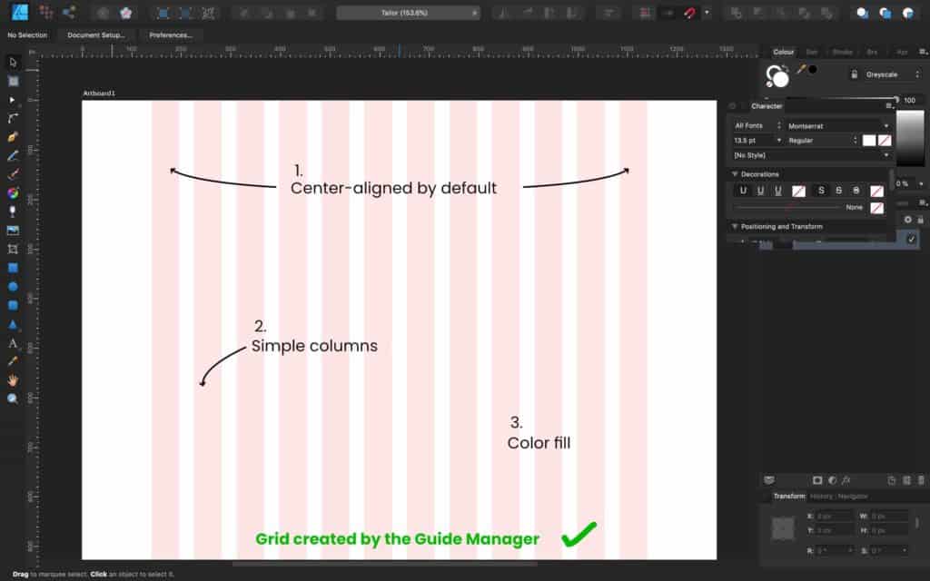
What we are working with is specifically called column guides.
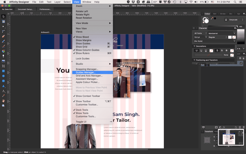
This can be accessed by going to your Affinity Designer toolbar on the top and clicking on view, followed by Guides Manager under the dropdown.
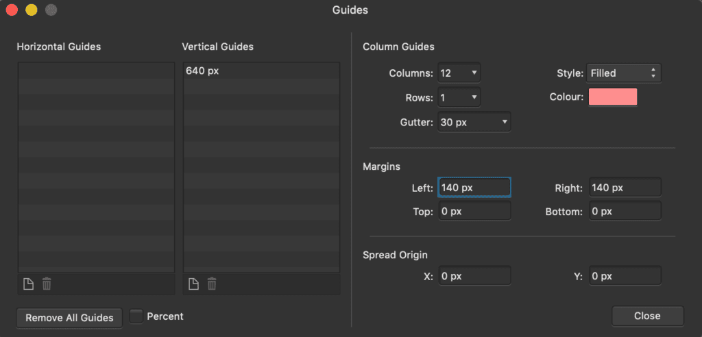
Your Guide Manager window will pop up, and you will see Column Guides on the right half. You will just have to fill in the settings according to your needs.
For this example, I will be working a a 1280px wide canvas. I want to set up a 12-column grid, with 30px spacing between each grid, and 140px of margins on my left and right. A very typical setup I use. And here are the steps:
Your column grid will then be created. It may not show yet because we have not toggle it on, but for now we can go ahead and close the Guide Manager. This is just a one-time setup for your project, meaning you can adjust the length of your artboard, and the grid will just go on continuously with your artboard.
For good measure, you could also create a vertical guide that will be placed in the center of your canvas. I do this because center-aligning is common in web design, so it’s faster to have a visual marker right there when I need it.
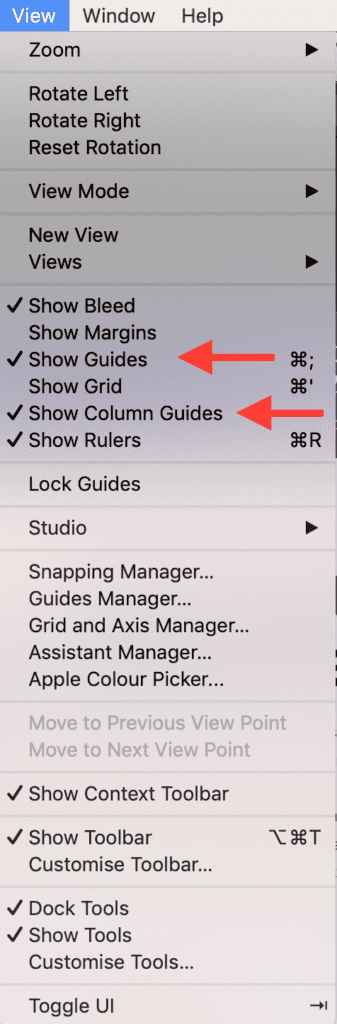
Go to your toolbar and click on View.
Under the dropdown, click to enable/disable Show Column Guides. This will show or hide your main grid. Toggle it on whenever you are working on your layout, and off when you want to take a look at your design by itself.
Under the dropdown, click to enable/disable Show Guides. This will toggle a blue vertical line that will run in the middle of your canvas.
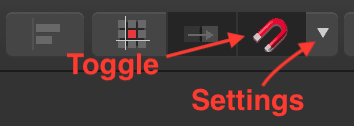
While creating and arranging your layouts, snapping should be turned on and configured properly to make sure your work is aligned pixel-perfectly to your grid.
Toggling the snapping can be done by clicking on the magnet icon somewhere at the top of your screen.
But you should configure it first by clicking on the dropdown button on the right of the icon, then tick the checkbox that says “Only snap to visible objects” and “Snap to guides”. Alternatively, you could also use the “Page layouts” preset, which will work well for snapping onto the grids that we have created.
Get yourself a copy Affinity Designer, or their entire suite of professional and versatile designing tools, available for macOS, Windows and iPad (for certain programs only), here at : https://affinity.serif.com/en-gb/
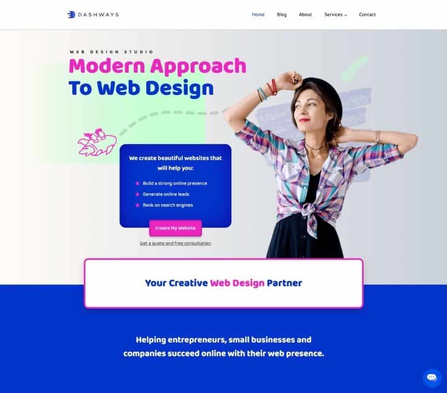
Elementor is the number one and perhaps the most famous page builder for WordPress. If you are looking for a reliable page building plugin to build your WordPress website, the free version of Elementor is probably my number one recommendation over all other popular page builders. The Elementor builder plugin is perfect for beginners, but also provides powerful functionality and customization for advanced users. Elementor saves you so much time no matter if you are new to building websites, or if you have been building websites for years and require creating complex layouts.
Elementor Pro on the other hand, is not something that everyone needs. The free version of Elementor has all tools you need to create a complete and custom website. With Pro, there are some feature additions to it that gives you the ability to easily create more powerful websites. Is Elementor Pro worth it? It really depends on the type of website you are building.
Rather than looking at how others are using Elementor Pro, I analyzed own usage and picked out biggest effect elementor Pro has on the way I build websites.
Let me start of by saying that Elementor Pro is very well worth it if you are trying to create websites that require dynamic functionality, conditional display, custom page templates and cool animations and effects. It also comes into handy if you need to do modifications to the theme, WooCommerce and even WordPress itself. It is loaded with plenty of advanced options that lets you create really cool and functional websites.
However, if you are creating a basic 5-page business website, Elementor Pro is really not necessary. You don't need the premium features such as custom templates for this. In fact, I have built more websites with the free version of Elementor than the pro version.
Rather than going into too much details, let me show you how I would use Elementor Pro and give you some examples of the kinds of websites that can be built with Elementor Pro.
Dynamic functionality helps to link your entire website together in a cohesive manner.
If I am looking to build a website that is able to display frequently updated content, that's when I will consider adding in dynamic functionality and advanced features.
Take for example, if I often run promotions and events for my business and want to showcase them on my website, I will want a system that makes it easy to update the information and content on the backend (with the help of custom post types and custom fields), while having it automatically display all these latest content into different areas on my website, such as the homepage and my dedicated promotions and events pages. This is called dynamic functionality.
There are some basic dynamic functions you already have in the free version of Elementor. One example is that you are able to add a "Latest Blog Posts" section into an area of your homepage. However with the pro version, you can do much more than just blog posts. You can even customize precisely how each dynamic content is being displayed.
Elementor Pro unlocks dynamic functionality within the page builder itself, making it really simple to create such advanced websites.
Besides dynamic functionality, the theme builder function is one of the pro features that I frequently use with Elementor Pro.
You now have the ability to customize almost any part of your website, such as your single post templates, single page templates, single product templates, blog post templates, product archives, blog post archives and more, which you have to otherwise do so by custom PHP code.
There are many uses for the theme builder. It is very customizable. Here are some specific examples of what I can do:
With some some of my clients that require very specific functionality, I find that Elementor Pro is able to help me do the job with ease.
The free version of Elementor comes with basic CSS entrance and exit effects, which is good enough for most website owners, depending on their needs. In fact, I tend to go light on animations and effects especially for business websites, where practicality and ease of use have more priority.
However, if you are trying to create a highly interactive visual masterpiece, Elementor Pro is an awesome tool that will help you achieve that. You have access to more advanced effects such as mouse tracking, scroll effects and more, without the need for extra coding.
Ever seen a website where things fly across, comes in and out of focus and dazzles you with their interactive effects? Elementor Pro has the capability to help you create such websites with relative ease.
If you are a Pro user, you also have access to a custom CSS editor within the page builder itself. You no longer have to create custom stylesheets for the smallest of adjustments. Website building is much more efficient and enjoyable when everything can be done in just one single tool. Pro widgets are also available for pro users, such as flip boxes, a contact form builder, countdown timers, custom sliders and more. This minimizes the need for additional third party plugins.
My favorite of them all is the ability to create custom sliders. Previously, I had to use additional plugins to create my custom sliders. With Elementor Pro I can create these sliders with ease and have full customization ability with the Elementor page builder itself.
As a bonus, Elementor Pro also comes with a basic popup builder tool too which you can use as a marketing tool to build an email list. It has several cool features like exit intent and other triggers. It is not the most advanced popup tool in the market, but it does the job. However, I do find myself using other popup tools most of the time though.
Here are other reasons that may also make Elementor Pro well worth it for you.
The Kits Library by Elementor is simply awesome! If you like your websites to have a modern feel with a designer's touch, you will not go wrong with this kit. The designs here have very fresh styling, with sophisticated design elements and beautiful color palettes. The subtle animations in some of their designs give it a very refined touch too.
Also, unlike section and page templates, these are pre-design templates for your entire site. If you ever piece together different pre-designed sections and pages for your website, you will find that you end up with a website that is not cohesive and consistent in design. Since the Kits Library provide you the template for your entire site, you can avoid this mess in just one quick import.

With Elementor Pro, you can build a website that rivals other websites built entirely from code (which are way more expensive to build due to the expertise required). This lowers your development costs, giving you a bigger profit margin.
Or, you can pass on the savings to your clients, putting yourself in a more competitive position.
A fair amount of knowledge in PHP and Javascript is required if you want to replicate what Elementor Pro can do with custom code. With the pro version, you no longer have to rope in a programmer to help you with custom coding, which once again lowers your development costs.
Before Elementor Pro, we would build websites by finding a theme that has the closest functionality to what the website requires. We usually find the functions we need across several themes. However, just can't seem to find the perfect theme that does it all.
The beauty of Elementor Pro is that it lets you build your own functionality with the theme builder, so you never have to settle for a rigid theme again.
Elementor Pro is generally suited for more complex websites that require more functionality. A website running the free version of Elementor could even move over to Elementor Pro if an "upgrade" is needed. Here are a few scenarios where Elementor Pro is likely to fit you well.
If you update content regularly on your website, then it makes sense for you to have Elementor Pro to help you display your latest content to the most important places, such as your homepage.
Examples of where Elementor Pro works well are listing and directory websites. Once example would be a music school where you want to display a list of music teachers.
If the goal of your website is to impress your viewers with interactive visuals, Elementor Pro is a great tool for this. They have plenty of advanced animations and effects that adds magic to your website.
Majority of the WordPress website that I have created requires some form of custom coding to the CSS or theme files. There's no one perfect tool that does all. However, Elementor Pro makes it really easy to achieve lots of these requirements without the need for any code.
Whether it's modifications to my WooCommerce cart page, or my blog archive pages, I am able to do it with ease using Elementor Pro.
Elementor Pro is a powerful tool, and it's really not required or even meant for basic websites. Here's where Elementor Pro is not needed.
If you are a beginner to website building, chances are you will not be building a dynamic website as your first website. There are many other web design techniques you should learn and master before moving on to learning and creating dynamic websites.
If you are only creating a simple website for a business, you will likely not utilize the additional functionality that comes with Elementor Pro.
Some websites are just created to display business information, like your location, opening hours, services, etc. These are information that hardly changes. The free version of Elementor is all you need to create such websites.
Here's Elementor Pro's pricing at the time of writing. Do check back on their pricing page to ensure the most updated prices.
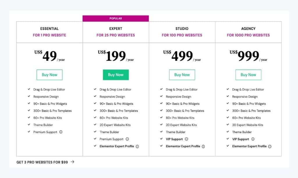
With their price of $49 per year for a single site, it's not just a good deal, but an amazing deal, considering the amount of third party plugins that you not only have to obtain / purchase, but maintain and ensure their cross-compatibility everytime you run your updates.
But the real value is where Elementor Pro can easily save you thousands of dollars on custom coding. You can create functionality only imaginable in a fully custom theme created from scratch by a theme developer, built specially for you.
Remember Elementor Pro is not just about their premium widgets (which I really love too), but the ability to transform your website into a custom one that feels like it was designed from scratch by a programmer.
As much as I love Elementor Pro and use it myself, I find that there are certain areas that are lacking. There are, however, other plugins to fill in the gap. Here's some pros and cons to give you a quick rundown on Elementor Pro again.
Elementor Pro has lots more features and functions that I have not mentioned in this article. What I have discussed so far are they ways Elementor Pro has impacted the way I build websites the most significantly.
I'm sure you'll be able to find more uses of Elementor Pro, and find out what's important when you try it out on your own.
Ultimately, I feel that Elementor Pro is very worth it if you have the proper usage for it. It will help you to cut down on many other third party plugins, and even do things that only can be done through custom coding.
I no longer recommend custom PHP coding as the default approach for my own clients' websites. Instead I work on their requirements with Elementor Pro so that I can complete the website much faster and at a cheaper price point, as I no longer have to pair up with a programmer to create basically the same website.
Check out Elementor Pro here.
WordPress is good for beginners for many use cases. It is a flexible and open source CMS (Content Management System) that is easy to users of all levels to create websites on. If you are a blogger, online seller, or you just need a website for your business, you definitely can't go wrong with WordPress.
Although it is easy to understand how WordPress works, it is not a simple process to build a website from scratch. You need to understand basic web design and development concepts if you are looking to create a website with a specific layout and design. It is better to seek out a professional to help you with this if you have bigger or specific requirements.
However, if you are looking to create a basic website or a blog and are happy with using premade layouts, then the process becomes much simpler, and seem less like a daunting task. All you need is to install a pre-designed theme or template, and customize your content from there. So is WordPress good for beginners? Read on to find out more.
I strongly believe that most businesses should consider using WordPress as their web building platform of choice because of its many benefits that many others can't match.
One important tip about owning business websites is that it's always important to have control over our content. Locking ourselves into a proprietary platform makes it difficult for us to export our content and make major changes in the future.
Furthermore most proprietary platforms handle the entire technology stack of your website, which means that you have no choice but to accept what is provided to you (e.g. you are restricted to having your website hosted in the other end of the world, where you should be ideally hosting as close to your target audience as possible).
Since WordPress is open source and only functions as the CMS, you have the flexibility to the best or most valuable services of your liking.
WordPress is also the most popular CMS in the market today. This means that it is very well developed, and will continue to be so moving forward. Generally, I believe it's always a safer choice to go with the more popular platforms rather than the lesser known ones.
It is a fact that some companies do not make it and may fold. This seems more likely to happen to smaller companies.
For a more in-depth explanation on this topic, read my post about why WordPress is worth learning today.
WordPress makes it easy for beginners to pick up. It's designed for function, flexibility and ease of use. Almost anyone who's familiar with working on a computer should not have a problem learning WordPress if he or she puts effort in it. Let's look at how WordPress makes it easy for a beginner to create a fully functional website.
Despite being a platform that is designed for advanced customizations and flexibility, WordPress also makes it easy for you to install themes and plugins to get your website up and running as soon as possible.
There are many beautiful themes and templates in all kinds of marketplaces, such as ThemeForest if you are looking for a premium theme, or the official WordPress theme repository that has over 8,000 free themes if you are not looking to pay for one. Either way, you should be able to find one that is designed for your industry or purpose.
The developers of many of these top selling themes usually make it a user-friendly experience for anyone to make basic customizations and content changes, giving you a fairly straightforward experience with your website building, from theme installation to customization.
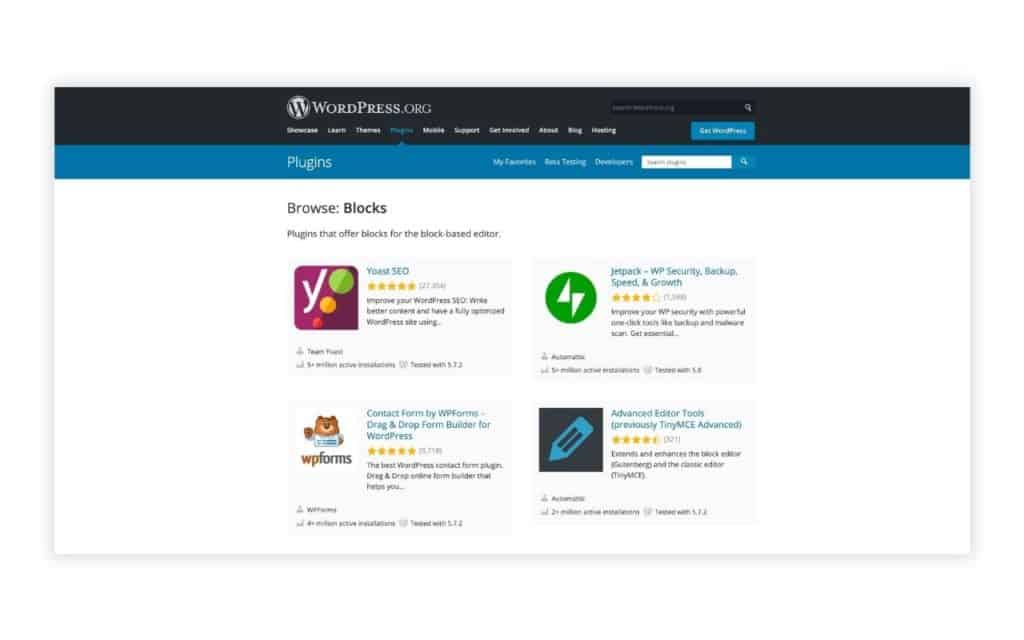
Using a free SEO plugin such as Yoast, the technical SEO aspects of your website can be easily taken care of without you having to meddle with any code.
SEO is very important as it determines whether your website is able to rank well on search engines like Google, and is something that you should not be neglecting on even as a beginner.
You can also install this free Google Analytics plugin by MonsterInsights to monitor and analyze your web traffic.
WordPress is very organized in the backend. This means that you will not be scratching your head trying to figure out how to navigate around things. Once you are familiar with the WordPress layout, you will be blazing through like a pro.
Your posts and pages are laid out for you in an organized manner, and every other important setting can be easily accessed in your menu bar on the backend. There is no need for you to access your website files and database to do all your standard website changes.
Everyone tries to integrate with WordPress these days because it makes sense to; they are the largest in the market.
You can easily integrate your favorite services with WordPress, such as Google Analytics, Facebook Shops, Mailchimp, Amazon Associates Program and more using plugins or pasting simple code snippets.
You can also implement contact forms on your website with the many contact form plugins available.
With WordPress, you will never be creating your website alone. There are a ton of communities focusing on all areas on WordPress that you can join and participate in.
You never have to fear not getting your questions answered and problems solved. And if you prefer a more structured approach to learning WordPress, consider taking online courses on this topic.

You will be delighted to hear that no coding skill is required for you to build a complete website on WordPress, even if you are looking to create a custom look with good visual content.
With user-friendly page builders such as Elementor and Elegant Theme's Divi, it's easy to design your own website starting with a pre-built layout, or even from scratch.
You will also have an easy time optimizing your page using an SEO plugin, which handles all the SEO metadata for you without the need to code.
There are courses online, both free and paid, that you can make use of when starting your WordPress learning journey. There are a ton of these courses out there.
It is entirely up to you to see which are the ones that will suit you best. Consider the instructor's teaching style and pace when choosing the right course for yourself.
If you are looking for a course that is well structured and more or less guaranteed, check out Udemy's range of WordPress courses. Or if you are looking for something good and free, there are plenty on Youtube, such as this one by freeCodeCamp:
I can't provide a fixed number for this, because everyone starts off with different levels of knowledge and learning speeds. However, I would say that if you are serious and dedicate your focus and time on this, you should be able to get your first website up and ready within a week by following step-by-step tutorials.
WordPress and web development is always a learning journey after all. Once you have mastered the basics, there are lots of progression paths to take to further gain more expertise.
You may start to learn to build more custom looking websites with page builders, and maybe in the future you could be exploring more advanced skills sets such as creating custom themes or interactive websites with Javascript, or modifying WordPress itself with PHP.
Because of how you can choose which services you want to run your WordPress website on, the cost of running a WordPress website can vary greatly. This also depends on what kind of server resources you need and the type of customer and technical support you require.
For a brand new basic website, your costs can be really low as you only require entry level hosting. Here is an example breakdown of what a typical basic website may cost:
Custom domain name: around $10 to $40 / year
Basic shared hosting: $2.99 / month from Hostinger (comes with a mailbox for your custom domain too)
Theme licenses: The7 multi-purpose theme from ThemeForest at $39 one-time fee
As you can see, running a WordPress website is not expensive at all, an in fact is competitively priced with other DIY platforms in the market. You can always switch out different vendors and hosting providers if you are not satisfied with your current one.
As a website owner, one worry you might have is whether you could be outgrowing your website in the future in terms of functionality and performance. WordPress is modular and scalable in these aspects, and it's a good platform to be on today without the need to switch platforms in the future.
With plenty of free and premium plugins available, you can power up your website with just a few clicks. Being the biggest CMS market today, there are all kinds of well-developed and robust plugins developed to provide additional functionality to your website, such as popups, email marketing integration, e-commerce, directory listings, analytics and more.
As you get more familiar with your website and viewers, you will find out that some of these features may help you improve your business, and these plugins are always available for you without having to switch platforms.
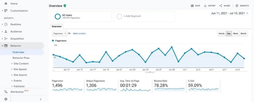
And if you manage to grow your audience to a huge number, you may need a better performing hosting plan. You can find out if your website is bringing in traffic by integrating it with Google Analytics.
WordPress is able to handle all levels of web traffic really well and upgrading your hosting plan is a simple task which many hosting providers will gladly help you out with.
You will usually get to this stage once you start experiencing poor loading times more frequently on your website.
WordPress may be a little challenging for a first-timer to build a website on from scratch, but it's definitely easy to maintain and do self-updates.
There are some instances where WordPress may not be suitable for you. You may want to consider a different solution if so. Here are a few.
Let me explain why you should not use WordPress for a complex web application. Firstly, you have to understand that there are many available plugins available for you to install on WordPress to make it powerful with all kinds of functions. You are able to turn your website into a multi-vendor marketplace, or even an auction site, with the help of plugins.
However, there are some businesses that are looking for an enterprise solution, where their website becomes the core of their business. They would want really granular control when it comes to customizing their website and its functionalities.
A good example that comes to mind is Amazon. You would not expect Amazon to operate on a WordPress site. They have a team of developers to consistently develop and maintain their custom website. This is tedious, costly, but absolutely necessary.
Also, if you are a beginner, it is highly unlikely that you will be coding up a custom website yourself.
If you are never going to edit a single word on your website, I would not recommend you to use WordPress, although it may seem like a good choice.
WordPress is a dynamic website. Instead of just loading your website files from a server, there are also other additional steps involved in the backend before the content is being served to your web browser.
One major one is that WordPress will need to query the database. This makes WordPress ideal if you are constantly adding or changing content to your site. But querying the database also takes up server resources. Why use these resources unnecessarily if you do not even have the need for it?
Although powerful hosting is really cheap nowadays, plus we can also make use of caching plugins to speed up websites, building a static website instead of a dynamic one like WordPress makes more sense here.
WordPress requires you to consistently perform updates to the core, theme and plugins. This is really important because now and then, just like any other platform, there will always be security vulnerabilities being discovered that requires patching.
Although, the theme and plugin developers will often get security issues fixed ASAP, you are still required to install the new updates once they roll them out.
This means that as a WordPress website owner, we should be going into the dashboard frequently to check if any updates are available. If you are not going to make use of the functionalities of WordPress, it may not make much sense to have to upkeep it.
Btw, did you know that since WordPress 3.7, minor core releases and translation files are automatically updated on the background by default? However, you will have to perform major core updates manually, unless you configured it otherwise.
Similarly for landing pages, there may not really be a need to run it on WordPress especially if you are not going to make changes on it, or if you only need just one single landing page. WordPress may just be overpowered for your use case, and there are much lighter alternatives such as Unbounce, Leadpages and Instapage.
By using these services, you drastically cut down the time needed to create a simple web page. You will not need to go through the hassle of setting up hosting, WordPress, SSL certificates and DNS like how you typically would when setting up a WordPress site, just for a single page.
I hope this post has helped you understand whether WordPress is a good choice when you are starting out as a beginner blogger or business owner. It is great for SEO, has lots of powerful themes and plugins, as well as a big community that will help you improve your site and blog!
There truly is no limit to the ways in which you can use WordPress. Let me know how this one influenced your decision making around WordPress before or after reading this post - share it with me in the comments!
Modern web design trends have focused on responsive web design. To put it simply, responsive design is the practice of designing web sites in a way that makes the site look good on whatever device is being used.
This might mean that the layout, features, content and media of a site looks different on a mobile phone than it does on a tablet or a desktop computer, but the site should still be usable and responsive to the device being used.
Increasingly, sites are being created that are responsive to the screen size of the device being used to view them. These are known as Responsive Web Design or RWD sites.
The term 'responsive web design' is also used to describe a design approach that adapts the presentation of a website to the device or platform being used to view it, usually on the fly and without requiring the user to refresh the page or click a link. For example, if you’re viewing a website on a mobile device, your browser will probably detect that the page is being displayed on a mobile device, and automatically render it using a mobile-specific style sheet.
This gives you a less cluttered view of the page while still showing you all the content, without having it being cut off or otherwise look and feel bad.
I've written an entire blog post about this topic about why responsive design is important. In short:
Over the years, responsive web design has evolved into an intuitive approach. How we design responsive websites today is very different from how we do it in the past. Let me explain how this is done in the past, and now.
Previously, websites were designed based on fixed pixel sizes. This was done with the desktop user in mind, since they were the majority share of web traffic back then.
When mobile usage started to rise, web developers started to cater to this group, by creating a mobile version of the same site, usually with highly stripped down features. The mobile version will then only be served to the visitor if it's detected that the visitor is on a mobile device.
This meant that there were actually two deployments of the site, the main site and the mobile version. And if your website does not have a mobile version, it is a big pain trying to use it.
During this period, mobile users were still relatively low in percentage, simply because the experience of surfing the web on a mobile device was not great.
However today, with almost everyone owning a powerful smartphone, mobile web surfing is a whole new ballgame. And developers started to realise that were many disadvantages or creating a mobile version of a site, which I will be going through later.
Today, responsive web design heavily relies on CSS, a style sheet language, to make the very same website responsive to all devices based on a fluid layout.
The web designer needs to understand that it is important to design websites with responsiveness in mind, and not be fixated on a single screen size, especially with so many devices and variations on the market today.
With this method, there is only a single deployment of the site, which brings about so much more benefits as compared to how it was previously done back then.
Modern responsive design comes with so many more benefits over the outdated way of serving two different sites depending on the device. Let me list the benefits here.
The first advantage is that you only need to keep one site updated. This dramatically saves you time and eliminates a lot of the hassle of maintaining two different sites that serve the same content.
Apart from content updates, performing regular plugin updates is also critical in a security standpoint. Having one version of a website with a responsive layout means that you only need to go through the hassle once.

By having two different sites, you are diluting your SEO efforts, simply because search engines treat them both as different sites. This not only causes duplicate content (which Google does not like), your backlinks to your site that you worked so hard for, will also be split into either one of the two sites.
Furthermore, it is really difficult to choose which version you want as your main site, as web traffic is so spread out from different devices these days, which just causes more confusion on where to direct your SEO efforts to.

With the old method, you have only two versions of the site, desktop and mobile. This means that other devices that fall between may not be able to load an ideal layout on their screen. This could lead to content cutoffs, or unoptimized font sizes.
With alternative devices today such as tablets and oversized smartphones, our website needs to cater to much more than just desktop or mobile. We need to take a more fluid approach to responsive web design that is able to load perfectly on any screen size, for both the desktop and mobile user.
Designing responsive websites requires a good grasp of CSS and how we use it to create fluid layouts.
How does responsive web design work? For a comprehensive guide, make sure to visit this guide from W3Schools. Here are some of the most important concepts for responsive website design.
Design used to be based on a fixed grid of 960 pixels, divided into 12 or 16 columns. Then it became adaptive with different pixel sizes at different screen sizes. Now we typically use a fluid grid, also known as a flexible grid, which are based on percentages instead.
In fluid grids, we do not think in pixels anymore, rather we think of the entire grid being divided into manageable columns. With knowledge of CSS, we can then stack these columns up according to how we want it to, which is generally more focused horizontally on desktop views, and vertically on mobile views.
As the screen size of the browser window changes, the columns themselves also change in a fluid manner. Inside these columns, our content and elements will be adjusted in relative to the parent container.
Images and media should be sized in relative units rather than in absolute dimensions such as in pixels. This ensures that your images and media displays how you want it to be no matter the screen size. You will also not have to worry about images being too small on desktop or too large till it gets cut off on mobile.
Here is a great video by Google Chrome Developers on how you should be managing responsive images.
Another approach to responsive web design is to use media queries to give you a more fine-tuned process to display your website contents. Media queries are also often used in conjunction with the fluid grid system for a well-covered responsive website. It can also be used by itself as a more adaptive design approach.
Media queries help you to set certain CSS properties and layouts depending on the size of the screen, and we use a breakpoint to determine the screen size the visitor is on. We can also use as many breakpoints as we want, giving extreme flexibility to our website layout.
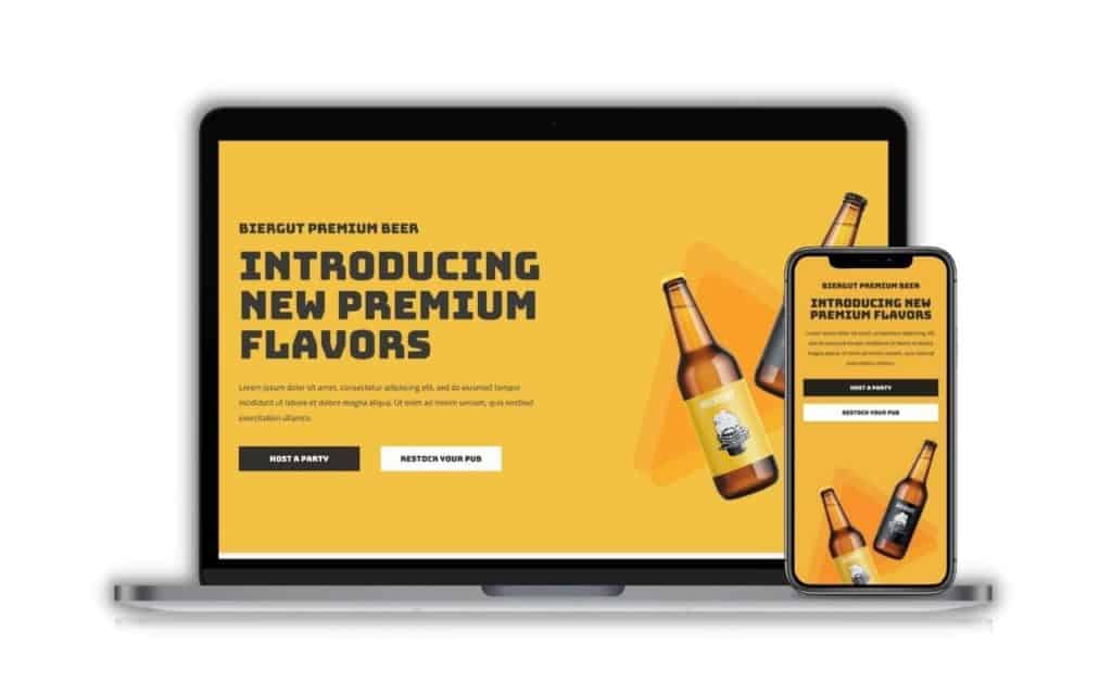
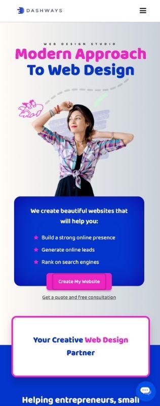
On my homepage, you can see that I have an obvious breakpoint for the mobile view. My layout has been designed to be generally more vertical-focused, while still keeping with the design flow. I've also dropped some graphics elements that I felt was not necessary in the mobile view.
Relative units ensure that our content is displayed at an appropriate size, whether you are browsing on a smaller or larger device with higher screen resolution.
Take font size for example. Using relative units such as 'em' or 'rem' instead of absolute pixel sizes, we can make sure our font sizes are displayed in relative to the parent element's font size, or the root element's font size.
With media queries, you can still specify absolute units depending on the screen size. So ultimately, this is a very flexible approach that each designer can choose to take.
This is a question many web developers ask themselves before commencing on the project. I personally do not think that there's a right or wrong answer, but there are benefits from choosing one over the other.
Mobile first simply means that we start designing our website based on a narrower screen size like how we view on a mobile device. Whereas a desktop first approach just means that we start designing based on how we want the desktop version to look like first.
There is a slight benefit in terms of load speeds for whichever you choose to design on first. So if you choose to have a mobile first approach, your page will display faster on mobile or smaller devices, because your CSS and media queries will be loaded earlier.
However, all websites have different requirements, and some of them are just much easier to design with desktop first. This is especially if you or your client prioritizes a very specific desktop layout.
So I generally would not harp on too much on which approach is used, as both gets the job done and the end user experience is similar.
They both refer to two very different things. Mobile first indexing is just a search engine's way of choosing a mobile view of your website to base it's indexation on, rather than the desktop view which was traditionally done.
Mobile first design approach on the other hand is whether the web designer chooses to design a website for mobile view first, then optimize it for desktop.
Here are some useful tips I have when you are designing for a responsive website.
I've came across websites with zero screen padding on mobile view. This creates a very unprofessional look and may even display a lack of design sense. Too much padding is also another problem where your content will be squeezed into a narrow column, making it both difficult to read and making your website feel out of proportion.
I get that some owners want to impress their visitors with fancy animations and high quality graphics. This is totally fine, but I would suggest keeping that to the desktop view only. On mobile, everyone tends to be a little more fast paced, and it's important to get your visitors to your content with the least resistance possible.
A common mistake I see web designers do is that they optimize the site layouts for all kinds of devices from desktops to mobiles, but they skip out on on larger screens. Although not as common, some visitors may use an ultra large screen such as a 32in iMac. Depending on what kind of approach you use to align your elements, such as using floats, your website may just fall apart on these larger screens.
With a desktop, you have a cursor to hover over elements such as flip boxes. However on touchscreen devices like our mobiles phones, the :hover pseudo-class will no longer work. It is therefore important to make sure the experience on the desktop can match the one on mobile.
This happens usually on mobile devices where the content is larger than the screen. Depending on the relevant CSS overflow property, you website may require side scrolling (which provides a terrible user experience), or is entirely cut off (making it impossible for the user to see). Make sure to wrap your content properly and avoid this at all cost.
Listen to this post
In the past, websites were designed to be viewed on specific devices. However, in today’s world, users use a variety of devices to access their favorite websites. In fact, it is estimated that 80% of shoppers begin their shopping on a mobile device.
This means that it is crucial to your business’ success in 2021 and beyond to have a website that is optimized for all devices, especially mobile devices. Otherwise, you are missing out on a significant amount of potential customers.
In fact, as of 2021, over half of the online traffic is coming from mobile devices, and this is expected to continue to grow in 2022 and beyond.
As more and more people are using mobile devices to look for products, it is important for businesses to ensure they are mobile friendly and are not missing out on potential customers, by having responsive web designs.
Why is responsive web design important? Here are 7 reasons I would like to share with you today.
Google is aiming to make the mobile web more accessible to consumers, by prioritizing mobile-friendly websites in their search results. Since 2019, mobile first indexing has been Google's default indexation method for new websites. If your website is not responsive today, it could mean that your customers may not even find you on Google.
Having a website that is responsive or adaptive will help you rank highly for search terms. This will increase user engagement and traffic to your site as you'll be able to rank for those terms that people are searching for in such a way that they find what they're looking for immediately.
This is no surprise that lot of SEO professionals recommend using mobile responsive web design for all websites, as responsive website design plays a part in today's SEO and search engine algorithm, and is one of the few ranking factors of Google since 2015.
Not only are there more mobile devices than computers in the world, but more of them have fast internet connections than ever before. Based on this market research, mobile users have been the majority share of traffic since 2017.
This means that the traditional way of designing websites for just the computer screen is a very outdated approach. It is already time for us to pivot to a mobile-first approach to web design.
Now you know that mobile users make up the majority share of traffic, you should be making sure every page on your website is fully responsive for all devices. Mobile users need to have the same experience as a desktop user, even if they have a smaller screen size.
They should only need to scroll down the page, and not have to pinch and zoom, and scroll sideways. This will prevent customers from getting disappointed by the difference in screens, which helps to maintain or improve your bounce rates on all screen sizes.

If your website is not responsive, customers are unlikely to take the effort to go through your content if it does not display well on your screen. For example, if your text is too small, your viewers will have a hard time reading your content.
Today, most users will simply leave your page, knowing that they can find content elsewhere. In fact if you do not implement responsive design in your website, viewers will have the impression that it's out of date or even broken. If you are running a lead generation campaign or generating sales online, you will have a hard time convincing the customer to submit any of their personal details on a website that is not functioning properly in their eyes, and it leads to poor conversion rates.
You need to understand that unresponsive websites are a huge conversion killer, and have no place in today's website standards.
When you are using a desktop, you have a larger screen and you are usually on stable wifi or ethernet. Depending on the type of industry you are in, a good web designer will make use of this opportunity to integrate eye-catching features such as animations, high resolution graphics and interactive elements to display on higher screen resolutions.
However on mobile devices, most users will appreciate websites that omit all these features, simply to have a better user experience such as faster load speeds, less data usage and getting to the content quickly. Most of the time, mobile users just want to reach your content as fast as possible. So by selectively removing certain design elements depending on their device type, you will be improving the user experience. This is an important technique for responsive design.
Imagine running expensive marketing campaigns such as SEO and paid ads, only for viewers to immediately leave your site and find a competitor instead, just because your content does not fit well on their screen. You are in fact providing free marketing to your competitors.
A frustrated user will always remember the experience he or she had when they were on your website. It is not a good impression, and that's where a well planned responsive website comes in to serve customers no matter the device they are on. Do a search on Google and see how many of your competitor's sites implement responsive design, and you will have an idea of where your website stands.
Nowadays, the e-commerce customer journey usually begins on mobile. People are reading personal emails and newsletters on mobile apps. These promotional campaigns will usually have a call to action that leads users to their e-commerce site or a promotional landing page. If everything runs seamlessly, you should be able to see high conversion rates.
But, if your site does not display well on their mobile devices, it is a huge obstacle for the user to move to their desktop to continue the journey, which ultimately defeats the purpose of the well thought out marketing campaign. Therefore all kinds of websites, including e-commerce websites, need to implement responsive web design.
Well the first thing is to simply load your website on your mobile device and make sure you to do an actual user test. Your goal here is to focus on responsive web design. Here are some key points to look out for:
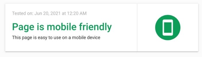
Click here to access the Google Mobile-Friendly Test tool
This is a crucial test because it involves Google, and we rely heavily on them for our SEO. This is more of a technical tip than a design tip, and is a tool for you to check if your website's mobile version is considered mobile-friendly according to Google's eyes.
Plug in the URL of the page you want to test from your website, and the app will analyze it usually under 1 minute, and give you the results immediately. It is important that you pass this test on all your pages, so that you will have a better chance of ranking on the search engines.
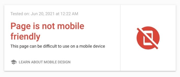
What you want to see: Page is mobile friendly
What you don't want to see: Page is not mobile friendly
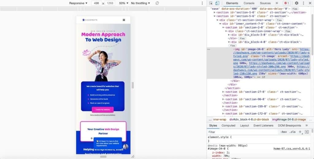
In order to check if your website is responsive on all devices, does it mean that you have to own all of these devices? Of course not. There are ways to simulate browser testing with free or paid platforms. A great free tool that I use to check my sites for responsive design in my initial testing is Chrome Developer Tools.
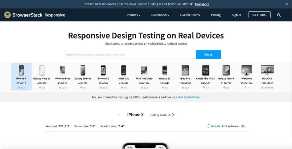
If you would like a more accurate simulation, you can also use this responsive tool from BrowserStack, where you can load your URL and test your website interactively on over 2000+ browsers and devices.
So I have outlined why responsive web design is important. It allows for better SEO rankings, increase conversion rates, lead generation and sales opportunities. I hope this blog post has been informative in deciding whether to update your website or redo it with a responsive layout. Enquire about our responsive web design service for a great starting point.