


Listen to this post
In the past, websites were designed to be viewed on specific devices. However, in today’s world, users use a variety of devices to access their favorite websites. In fact, it is estimated that 80% of shoppers begin their shopping on a mobile device.
This means that it is crucial to your business’ success in 2021 and beyond to have a website that is optimized for all devices, especially mobile devices. Otherwise, you are missing out on a significant amount of potential customers.
In fact, as of 2021, over half of the online traffic is coming from mobile devices, and this is expected to continue to grow in 2022 and beyond.
As more and more people are using mobile devices to look for products, it is important for businesses to ensure they are mobile friendly and are not missing out on potential customers, by having responsive web designs.
Why is responsive web design important? Here are 7 reasons I would like to share with you today.
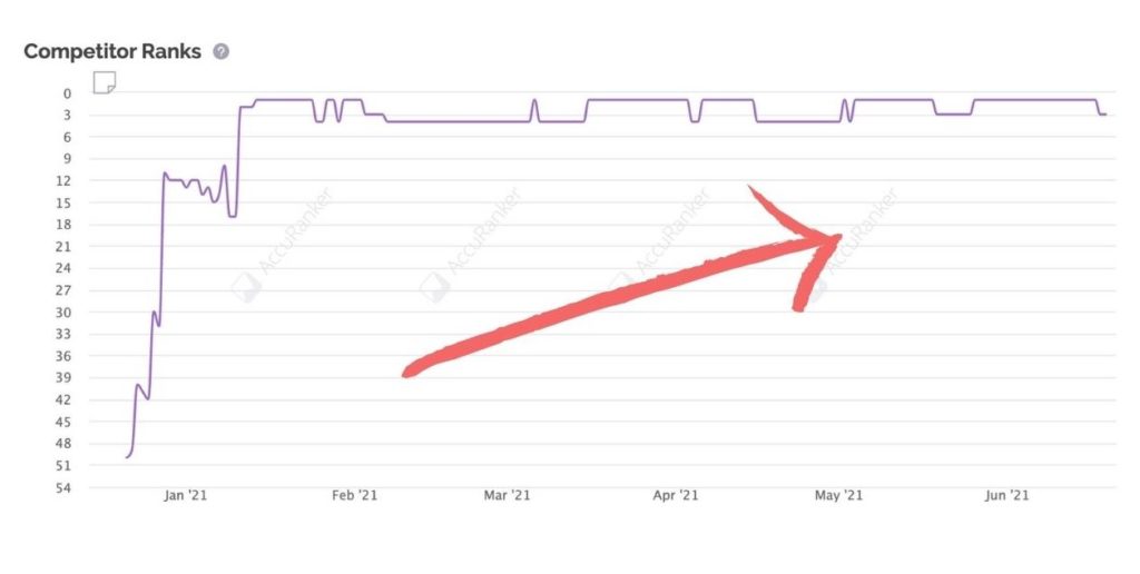
Google is aiming to make the mobile web more accessible to consumers, by prioritizing mobile-friendly websites in their search results. Since 2019, mobile first indexing has been Google's default indexation method for new websites. If your website is not responsive today, it could mean that your customers may not even find you on Google.
Having a website that is responsive or adaptive will help you rank highly for search terms. This will increase user engagement and traffic to your site as you'll be able to rank for those terms that people are searching for in such a way that they find what they're looking for immediately.
This is no surprise that lot of SEO professionals recommend using mobile responsive web design for all websites, as responsive website design plays a part in today's SEO and search engine algorithm, and is one of the few ranking factors of Google since 2015.
Not only are there more mobile devices than computers in the world, but more of them have fast internet connections than ever before. Based on this market research, mobile users have been the majority share of traffic since 2017.
This means that the traditional way of designing websites for just the computer screen is a very outdated approach. It is already time for us to pivot to a mobile-first approach to web design.
Now you know that mobile users make up the majority share of traffic, you should be making sure every page on your website is fully responsive for all devices. Mobile users need to have the same experience as a desktop user, even if they have a smaller screen size.
They should only need to scroll down the page, and not have to pinch and zoom, and scroll sideways. This will prevent customers from getting disappointed by the difference in screens, which helps to maintain or improve your bounce rates on all screen sizes.

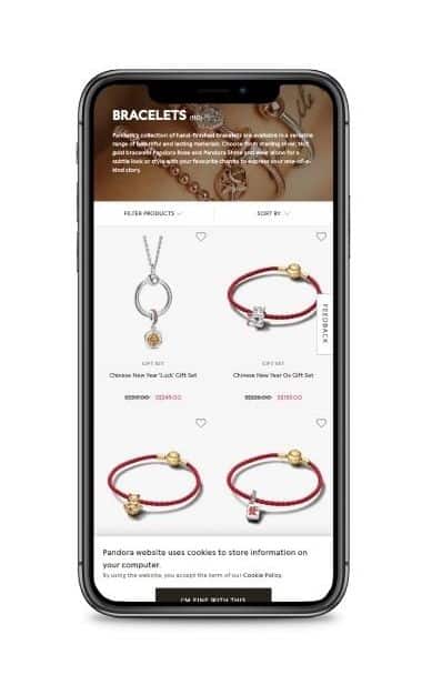
If your website is not responsive, customers are unlikely to take the effort to go through your content if it does not display well on your screen. For example, if your text is too small, your viewers will have a hard time reading your content.
Today, most users will simply leave your page, knowing that they can find content elsewhere. In fact if you do not implement responsive design in your website, viewers will have the impression that it's out of date or even broken. If you are running a lead generation campaign or generating sales online, you will have a hard time convincing the customer to submit any of their personal details on a website that is not functioning properly in their eyes, and it leads to poor conversion rates.
You need to understand that unresponsive websites are a huge conversion killer, and have no place in today's website standards.

When you are using a desktop, you have a larger screen and you are usually on stable wifi or ethernet. Depending on the type of industry you are in, a good web designer will make use of this opportunity to integrate eye-catching features such as animations, high resolution graphics and interactive elements to display on higher screen resolutions.
However on mobile devices, most users will appreciate websites that omit all these features, simply to have a better user experience such as faster load speeds, less data usage and getting to the content quickly. Most of the time, mobile users just want to reach your content as fast as possible. So by selectively removing certain design elements depending on their device type, you will be improving the user experience. This is an important technique for responsive design.
Imagine running expensive marketing campaigns such as SEO and paid ads, only for viewers to immediately leave your site and find a competitor instead, just because your content does not fit well on their screen. You are in fact providing free marketing to your competitors.
A frustrated user will always remember the experience he or she had when they were on your website. It is not a good impression, and that's where a well planned responsive website comes in to serve customers no matter the device they are on. Do a search on Google and see how many of your competitor's sites implement responsive design, and you will have an idea of where your website stands.
Nowadays, the e-commerce customer journey usually begins on mobile. People are reading personal emails and newsletters on mobile apps. These promotional campaigns will usually have a call to action that leads users to their e-commerce site or a promotional landing page. If everything runs seamlessly, you should be able to see high conversion rates.
But, if your site does not display well on their mobile devices, it is a huge obstacle for the user to move to their desktop to continue the journey, which ultimately defeats the purpose of the well thought out marketing campaign. Therefore all kinds of websites, including e-commerce websites, need to implement responsive web design.
Well the first thing is to simply load your website on your mobile device and make sure you to do an actual user test. Your goal here is to focus on responsive web design. Here are some key points to look out for:
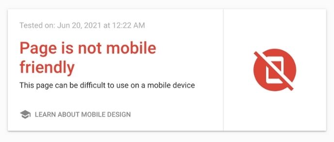
Click here to access the Google Mobile-Friendly Test tool
This is a crucial test because it involves Google, and we rely heavily on them for our SEO. This is more of a technical tip than a design tip, and is a tool for you to check if your website's mobile version is considered mobile-friendly according to Google's eyes.
Plug in the URL of the page you want to test from your website, and the app will analyze it usually under 1 minute, and give you the results immediately. It is important that you pass this test on all your pages, so that you will have a better chance of ranking on the search engines.
What you want to see: Page is mobile friendly

What you don't want to see: Page is not mobile friendly
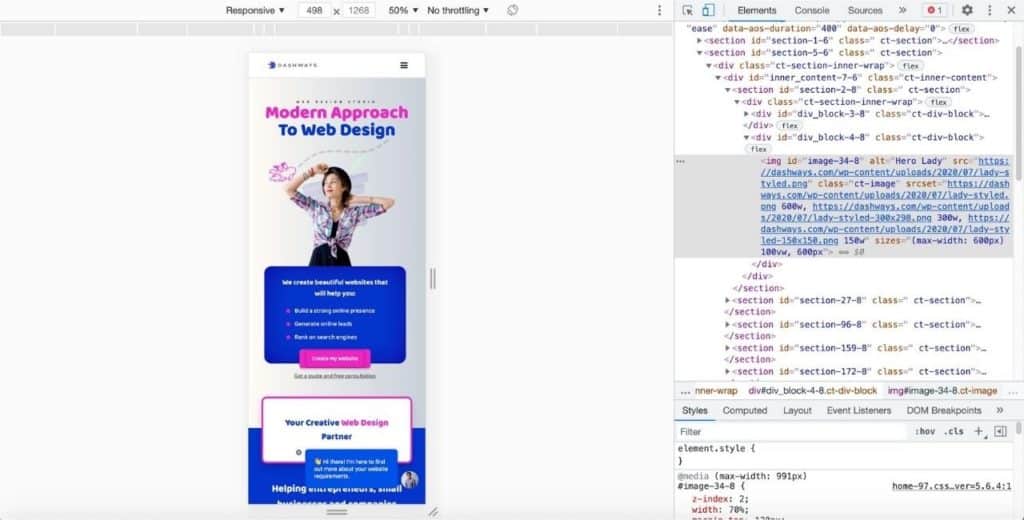
In order to check if your website is responsive on all devices, does it mean that you have to own all of these devices? Of course not. There are ways to simulate browser testing with free or paid platforms. A great free tool that I use to check my sites for responsive design in my initial testing is Chrome Developer Tools.
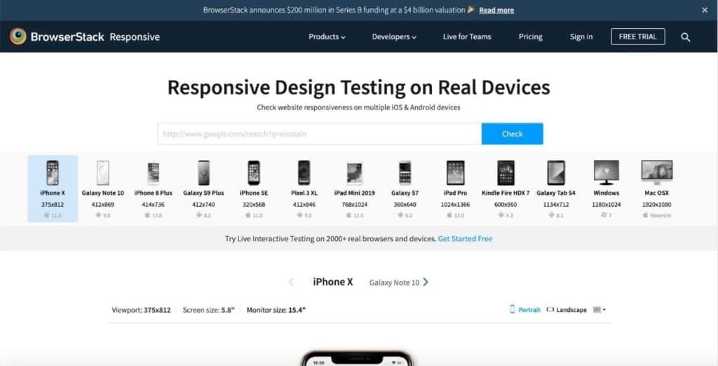
If you would like a more accurate simulation, you can also use this responsive tool from BrowserStack, where you can load your URL and test your website interactively on over 2000+ browsers and devices.
So I have outlined why responsive web design is important. It allows for better SEO rankings, increase conversion rates, lead generation and sales opportunities. I hope this blog post has been informative in deciding whether to update your website or redo it with a responsive layout. Enquire about our responsive web design service for a great starting point.