

Modern web design trends have focused on responsive web design. To put it simply, responsive design is the practice of designing web sites in a way that makes the site look good on whatever device is being used.
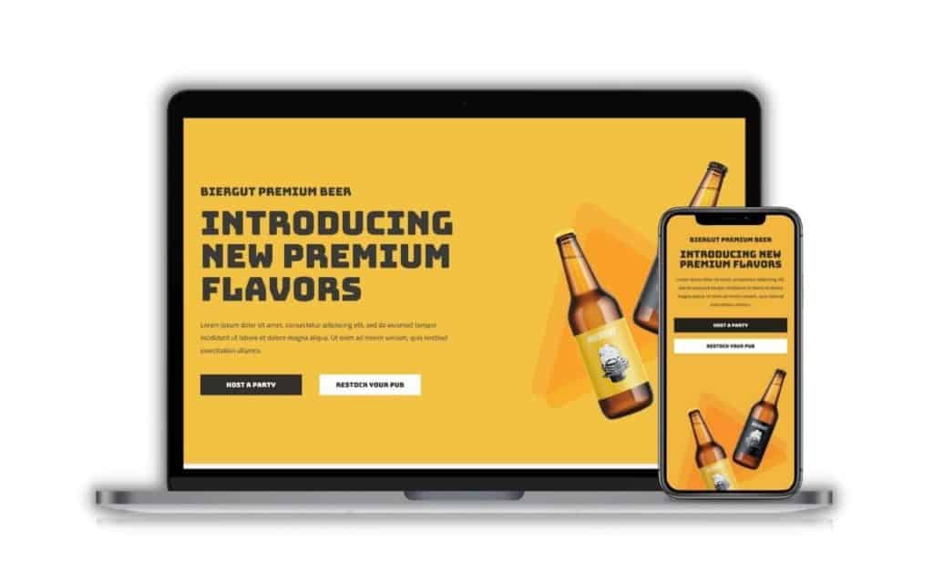
This might mean that the layout, features, content and media of a site looks different on a mobile phone than it does on a tablet or a desktop computer, but the site should still be usable and responsive to the device being used.
Increasingly, sites are being created that are responsive to the screen size of the device being used to view them. These are known as Responsive Web Design or RWD sites.
The term 'responsive web design' is also used to describe a design approach that adapts the presentation of a website to the device or platform being used to view it, usually on the fly and without requiring the user to refresh the page or click a link. For example, if you’re viewing a website on a mobile device, your browser will probably detect that the page is being displayed on a mobile device, and automatically render it using a mobile-specific style sheet.
This gives you a less cluttered view of the page while still showing you all the content, without having it being cut off or otherwise look and feel bad.
I've written an entire blog post about this topic about why responsive design is important. In short:
Over the years, responsive web design has evolved into an intuitive approach. How we design responsive websites today is very different from how we do it in the past. Let me explain how this is done in the past, and now.
Previously, websites were designed based on fixed pixel sizes. This was done with the desktop user in mind, since they were the majority share of web traffic back then.
When mobile usage started to rise, web developers started to cater to this group, by creating a mobile version of the same site, usually with highly stripped down features. The mobile version will then only be served to the visitor if it's detected that the visitor is on a mobile device.
This meant that there were actually two deployments of the site, the main site and the mobile version. And if your website does not have a mobile version, it is a big pain trying to use it.
During this period, mobile users were still relatively low in percentage, simply because the experience of surfing the web on a mobile device was not great.
However today, with almost everyone owning a powerful smartphone, mobile web surfing is a whole new ballgame. And developers started to realise that were many disadvantages or creating a mobile version of a site, which I will be going through later.
Today, responsive web design heavily relies on CSS, a style sheet language, to make the very same website responsive to all devices based on a fluid layout.
The web designer needs to understand that it is important to design websites with responsiveness in mind, and not be fixated on a single screen size, especially with so many devices and variations on the market today.
With this method, there is only a single deployment of the site, which brings about so much more benefits as compared to how it was previously done back then.
Modern responsive design comes with so many more benefits over the outdated way of serving two different sites depending on the device. Let me list the benefits here.

The first advantage is that you only need to keep one site updated. This dramatically saves you time and eliminates a lot of the hassle of maintaining two different sites that serve the same content.
Apart from content updates, performing regular plugin updates is also critical in a security standpoint. Having one version of a website with a responsive layout means that you only need to go through the hassle once.

By having two different sites, you are diluting your SEO efforts, simply because search engines treat them both as different sites. This not only causes duplicate content (which Google does not like), your backlinks to your site that you worked so hard for, will also be split into either one of the two sites.
Furthermore, it is really difficult to choose which version you want as your main site, as web traffic is so spread out from different devices these days, which just causes more confusion on where to direct your SEO efforts to.

With the old method, you have only two versions of the site, desktop and mobile. This means that other devices that fall between may not be able to load an ideal layout on their screen. This could lead to content cutoffs, or unoptimized font sizes.
With alternative devices today such as tablets and oversized smartphones, our website needs to cater to much more than just desktop or mobile. We need to take a more fluid approach to responsive web design that is able to load perfectly on any screen size, for both the desktop and mobile user.
Designing responsive websites requires a good grasp of CSS and how we use it to create fluid layouts.
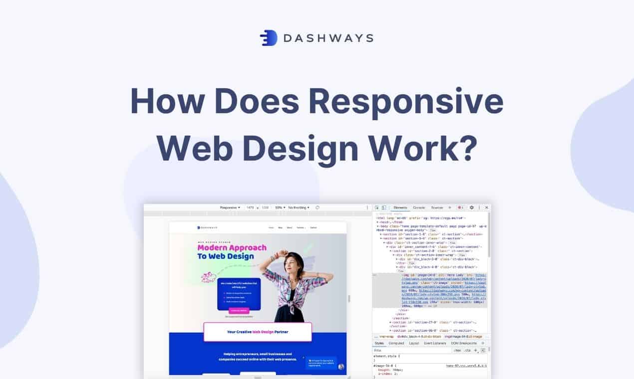
How does responsive web design work? For a comprehensive guide, make sure to visit this guide from W3Schools. Here are some of the most important concepts for responsive website design.
Design used to be based on a fixed grid of 960 pixels, divided into 12 or 16 columns. Then it became adaptive with different pixel sizes at different screen sizes. Now we typically use a fluid grid, also known as a flexible grid, which are based on percentages instead.
In fluid grids, we do not think in pixels anymore, rather we think of the entire grid being divided into manageable columns. With knowledge of CSS, we can then stack these columns up according to how we want it to, which is generally more focused horizontally on desktop views, and vertically on mobile views.
As the screen size of the browser window changes, the columns themselves also change in a fluid manner. Inside these columns, our content and elements will be adjusted in relative to the parent container.
Images and media should be sized in relative units rather than in absolute dimensions such as in pixels. This ensures that your images and media displays how you want it to be no matter the screen size. You will also not have to worry about images being too small on desktop or too large till it gets cut off on mobile.
Here is a great video by Google Chrome Developers on how you should be managing responsive images.
Another approach to responsive web design is to use media queries to give you a more fine-tuned process to display your website contents. Media queries are also often used in conjunction with the fluid grid system for a well-covered responsive website. It can also be used by itself as a more adaptive design approach.
Media queries help you to set certain CSS properties and layouts depending on the size of the screen, and we use a breakpoint to determine the screen size the visitor is on. We can also use as many breakpoints as we want, giving extreme flexibility to our website layout.
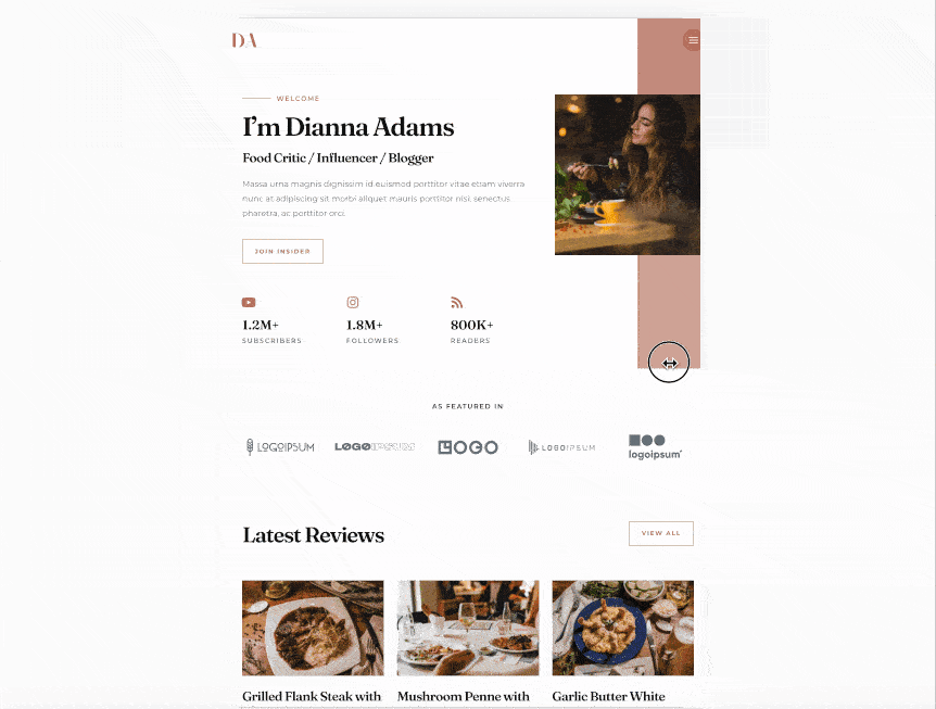
On my homepage, you can see that I have an obvious breakpoint for the mobile view. My layout has been designed to be generally more vertical-focused, while still keeping with the design flow. I've also dropped some graphics elements that I felt was not necessary in the mobile view.


Relative units ensure that our content is displayed at an appropriate size, whether you are browsing on a smaller or larger device with higher screen resolution.
Take font size for example. Using relative units such as 'em' or 'rem' instead of absolute pixel sizes, we can make sure our font sizes are displayed in relative to the parent element's font size, or the root element's font size.
With media queries, you can still specify absolute units depending on the screen size. So ultimately, this is a very flexible approach that each designer can choose to take.
This is a question many web developers ask themselves before commencing on the project. I personally do not think that there's a right or wrong answer, but there are benefits from choosing one over the other.
Mobile first simply means that we start designing our website based on a narrower screen size like how we view on a mobile device. Whereas a desktop first approach just means that we start designing based on how we want the desktop version to look like first.
There is a slight benefit in terms of load speeds for whichever you choose to design on first. So if you choose to have a mobile first approach, your page will display faster on mobile or smaller devices, because your CSS and media queries will be loaded earlier.
However, all websites have different requirements, and some of them are just much easier to design with desktop first. This is especially if you or your client prioritizes a very specific desktop layout.
So I generally would not harp on too much on which approach is used, as both gets the job done and the end user experience is similar.
They both refer to two very different things. Mobile first indexing is just a search engine's way of choosing a mobile view of your website to base it's indexation on, rather than the desktop view which was traditionally done.
Mobile first design approach on the other hand is whether the web designer chooses to design a website for mobile view first, then optimize it for desktop.
Here are some useful tips I have when you are designing for a responsive website.
I've came across websites with zero screen padding on mobile view. This creates a very unprofessional look and may even display a lack of design sense. Too much padding is also another problem where your content will be squeezed into a narrow column, making it both difficult to read and making your website feel out of proportion.
I get that some owners want to impress their visitors with fancy animations and high quality graphics. This is totally fine, but I would suggest keeping that to the desktop view only. On mobile, everyone tends to be a little more fast paced, and it's important to get your visitors to your content with the least resistance possible.
A common mistake I see web designers do is that they optimize the site layouts for all kinds of devices from desktops to mobiles, but they skip out on on larger screens. Although not as common, some visitors may use an ultra large screen such as a 32in iMac. Depending on what kind of approach you use to align your elements, such as using floats, your website may just fall apart on these larger screens.
With a desktop, you have a cursor to hover over elements such as flip boxes. However on touchscreen devices like our mobiles phones, the :hover pseudo-class will no longer work. It is therefore important to make sure the experience on the desktop can match the one on mobile.
This happens usually on mobile devices where the content is larger than the screen. Depending on the relevant CSS overflow property, you website may require side scrolling (which provides a terrible user experience), or is entirely cut off (making it impossible for the user to see). Make sure to wrap your content properly and avoid this at all cost.